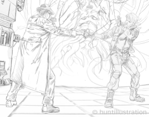
I found Jon Hunt through the “Hire An Illustrator” website. I was impressed by his online portfolio. (Here are Jon’s Facebook page and blog.) We exchanged emails, discussed the scope of the work, negotiated a payment, and finalized an agreement. I gave Jon the basic action tableau–male and female protagonists vs threatening alien–and he did some preliminary sketches:
In discussing these first sketches via email, Jon asked for more context to help him do his job. I sent him two longish excerpts of cyberpunk description from the book. After more correspondence, Jon produced this brilliant sketch:
The illustration was excellent, with a gritty mix of cyberpunk and Giger. Unfortunately the action depicted occurs in a Southern California-style Craftsman bungalow in the novel. More emails, and more sketches followed:
As the sequence of action sketches in the bungalow progressed, we dealt with picking the right fonts for the title. I’ve been told that a good title for a trade paperback needs to be visible from 15 feet away or more, but I also wanted it to be punk and distressed. The more distressed the better.
I liked the font “Bullet in Your Head” and Jon distressed it further. The last illustration is essentially the front cover. I’m afraid I badgered Jon with way too many minor corrections along the way, but the results are wonderful. Without the lettering, Jon’s illustration is a stunning science fiction poster:
Now, let’s go back to the cyberpunk sketch midpoint in this whole process:
I realized I had the potential for a back cover in this sketch, and I asked Jon to play around with it. He came up with the following, first in gray tones and then in colors to match the front cover in tone and mood. One sign in the grimy cityscape spells out “Gibsons” in a nice touch:
I now had what I needed; sharply drawn, gorgeously illustrated, hauntingly themed front and back covers which I then turned over to my book designer. He put them together to produce this book cover which made superb use of Jon’s back cover design to create a wraparound jacket with an integrated spine:
But the use of Jon’s captivating illustrations didn’t stop there. I needed a two-sided, full color publicity postcard to distribute around the Bay Area, and Jon came through once again:
That’s how the cover of my novel 1% Free was constructed. The book’s insides were another matter entirely.
Categories: Uncategorized


